Thursday, November 28, 2013

I Can See Clearly Now

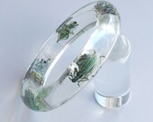
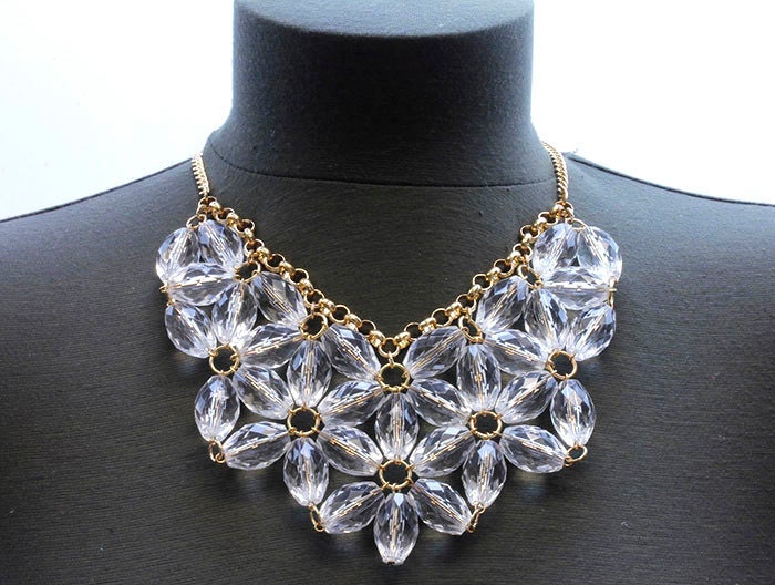
Lucite is a remarkably strong, and versatile, design material. Designers have utilized Lucite's unique properties to create amazing creations. At one time, more popular than in more current years, Lucite is still highly regarded for its functionality and high-end style.

Technichally known as poly(methyl methacrylate), more common names are Acrylic or sometimes Acrylic Glass. The name Lucite is actually a brand name of a DuPont product. Similarly, Plexiglass is also an acrylic product name from Rohm & Haas.

Lucite was developed in the late 1920s, and first commercially applied in the early 1930s. Designers loved its versatile properties, and immediately began to use it in products from jewelry to furniture.

Lucite saw a more utilitarian use during WWII as its strength, and light weight, made it suitable for windshields and windows on planes.

Although Lucite stills sees the largest amount of use in the manufacturing, transportation, and medical fields, artists and designers still turn to it today.

Lucite Artists - The "Invisible" People
Philippe Starck's "Louis" ghost chair is perhaps one of the more iconic designs in recent years. However, glass and Lucite designs date back well into the 1930s.

Philippe Stark "Louis" Ghost Chair - starck.com

An early example of a designer's use of Lucite was makeup magnate Helena Rubinstein's bed in her New York apartment. Featured in LIFE Magazine in 1941, "Madame" Rubenstein had the bed designed for her by Ladislas Medgyes, and made for $675. (Which she considered a bargain.)

The bed was lit by fluorescent light, which takes advantage of Lucite's unique light transmission properties. Lucite tends to have light bounce around inside its walls until coming out the other side. This allows Lucite to "glow" when exposed to certain light sources.

"In her lucite bed, Madame reads by the fluorescent lighting which infuses the head and foot. She had the bed built for $675, which she considers a bargain."
LIFE Magazine, July 21, 1941, pg. 37

Designers are still using Lucite in unique, creative and beautiful ways.

For example, the office space shown below, from designer Vanessa Deleon, mixes lush textures with smooth, shimmering, finishes.

The lightness of the room would become too heavy if a solid chair had been used.

A replica of a Lucite chair from the Helana Rubenstein New York apartment blends seamlessly with chandelier, the mirrored desk and the large mirror in the corner.

More images of this Vanessa Deleon design are available here.

Eclectic Office  by designer Vanessa Deleon

Charles Hollis Jones
Charles Hollis Jones is an American artist and furniture designer recognized for his use of acrylic and Lucite in a variety of his designs. [Wikipedia]

Charles Hollis Jones furniture displayed at the Elrod House
"Masters of Modernism: Now Clear This" Palm Springs Life Magazine, February 2009

See also, "Get the Look", below.


Vladimir Kagan
Vladimir Kagan (born 1927 in Worms, Germany), furniture designer. Emigrated to the United States in 1938. Graduated from the School of Industrial Art in 1946, where he was an architecture major. Studied architecture at Columbia University. Opened his first shop in New York in 1949. Early work included furniture for the Delegate's Cocktail Lounge at the United Nations and furniture for the "Monsanto House of the Future" at Disneyland. [Wikipedia]


Karl Springer
Karl Springer, was a designer and manufacturer of luxury furniture and accessories. Born in Berlin, he came to New York in 1957. Mr. Springer worked with many materials to translate pure, classical shapes into contemporary, custom-made furniture, lighting and accessories. His signature styles were classical Chinese and Art Deco. He opened his first workshop in the early 1960s and started concentrating on furniture design in 1965. [From the New York Times Obituary for Karl Springer]


Get the Look


LuxeArtifacts on Etsy
tatterandfray on Etsy
TheARTofVintageGoods on Etsy
KolosStudio on Etsy
FashionDiggersMiami on Etsy
DottieMaeVintage on Etsy
Platform9 on Etsy
unionmadebride on Etsy
GreenFlamingoVintage on Etsy

Saturday, April 6, 2013

Design Inspiration - Gatsby Style

F. Scott Fitzgerald’s The Great Gatsby is considered one of the great American novels.

This summer, a new film version is being released, and Art Deco and styles from the Roaring Twenties is experiencing a resurgence.

Design Inspiration… Quotes from The Great Gatsby

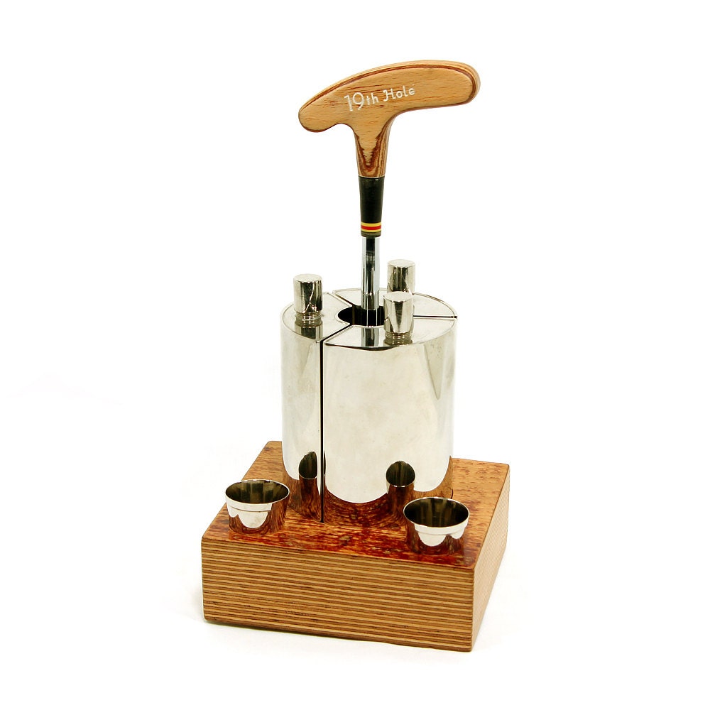
19th Hole Mini Bar, Triple Flask Set in Wood Carrier, German Tin-Lined Flasks & 2 Shot Cups, AHS (Alfred Harald Schneider), Made in Germany from ZoeDesignsVintage on etsy.com
"I noticed that she wore
her evening-dress,
all her dresses,
like sports clothes..."

"I was flattered
to go places with her,
because she was
a golf champion,
and every one
knew her name."
~ Nick Carraway on Jordan Baker ~


"On a chance we tried an important-looking door, and walked into a high Gothic library, paneled with carved English oak, and probably transported complete from some ruin overseas.

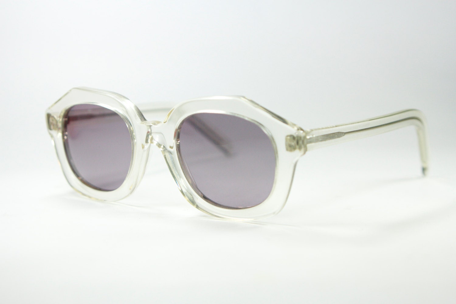
A stout, middle-aged man, with enormous owl-eyed spectacles, was sitting somewhat drunk on the edge of a great table, staring with unsteady concentration at the shelves of books."
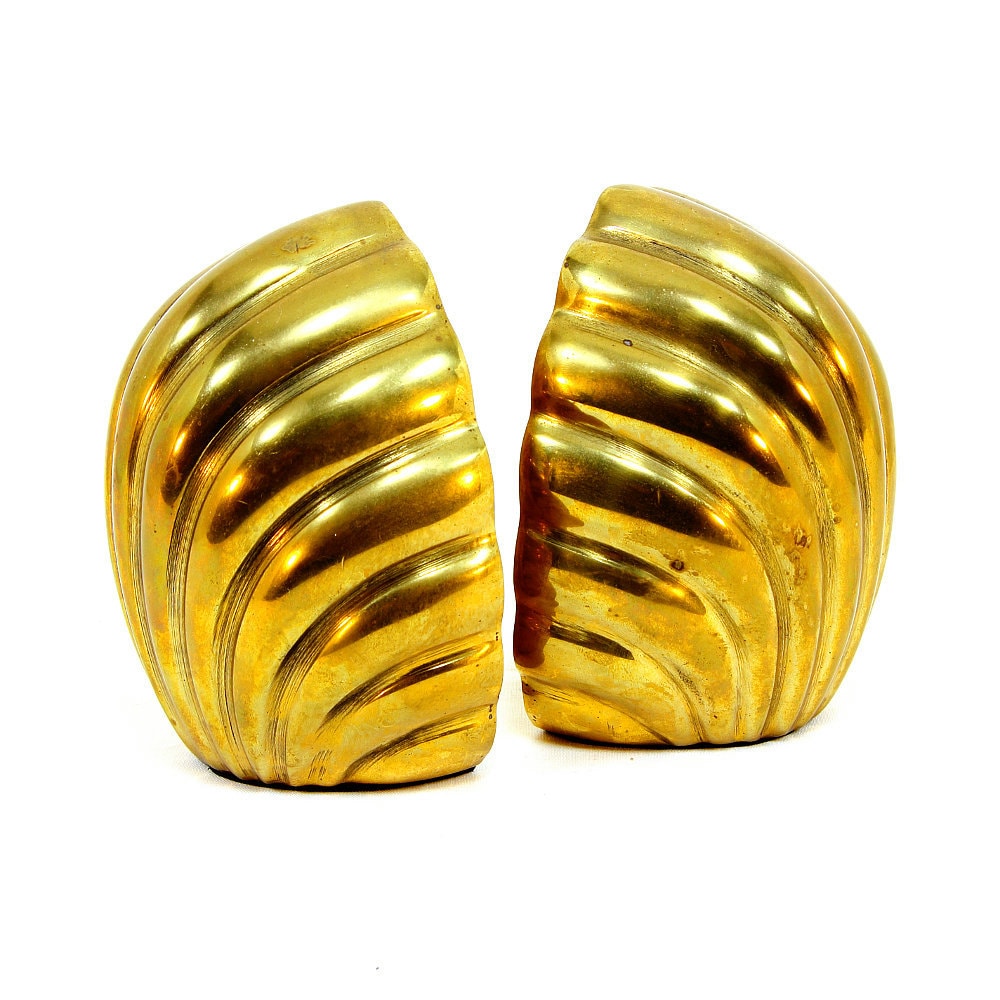
Brass Seashell Bookends, Hollywood Regency, Art Deco Style, Nautical Theme, Shell Bookends from ZoeDesignsVintage on etsy.com


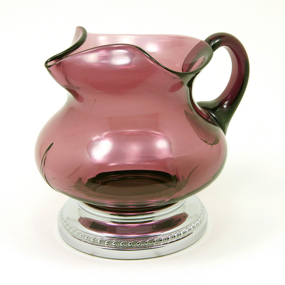
 Krome-Kraft Amethyst Pitcher, Art Deco Style Cocktail Pitcher, Cambridge Glass, Purple with Chrome Base, Farber Bros., ca. 1940s from ZoeDesignsVintage on etsy.com
"Suddenly one of the gypsies, in trembling opal, seizes a cocktail
out of the air, dumps it down for courage and, moving her hands
like Frisco

, dances out alone on
the canvas platform. A momentary hush; the orchestra leader varies his rhythm obligingly for her, and there is a burst of chatter as the erroneous news goes around that she is Gilda Gray's understudy
from the 'Follies.'
The party has begun."


"Finally we came to Gatsby's own apartment, a bedroom and a bath, and an Adam study
, where we sat down and drank a glass of some Chartreuse he took from a cupboard in the wall.

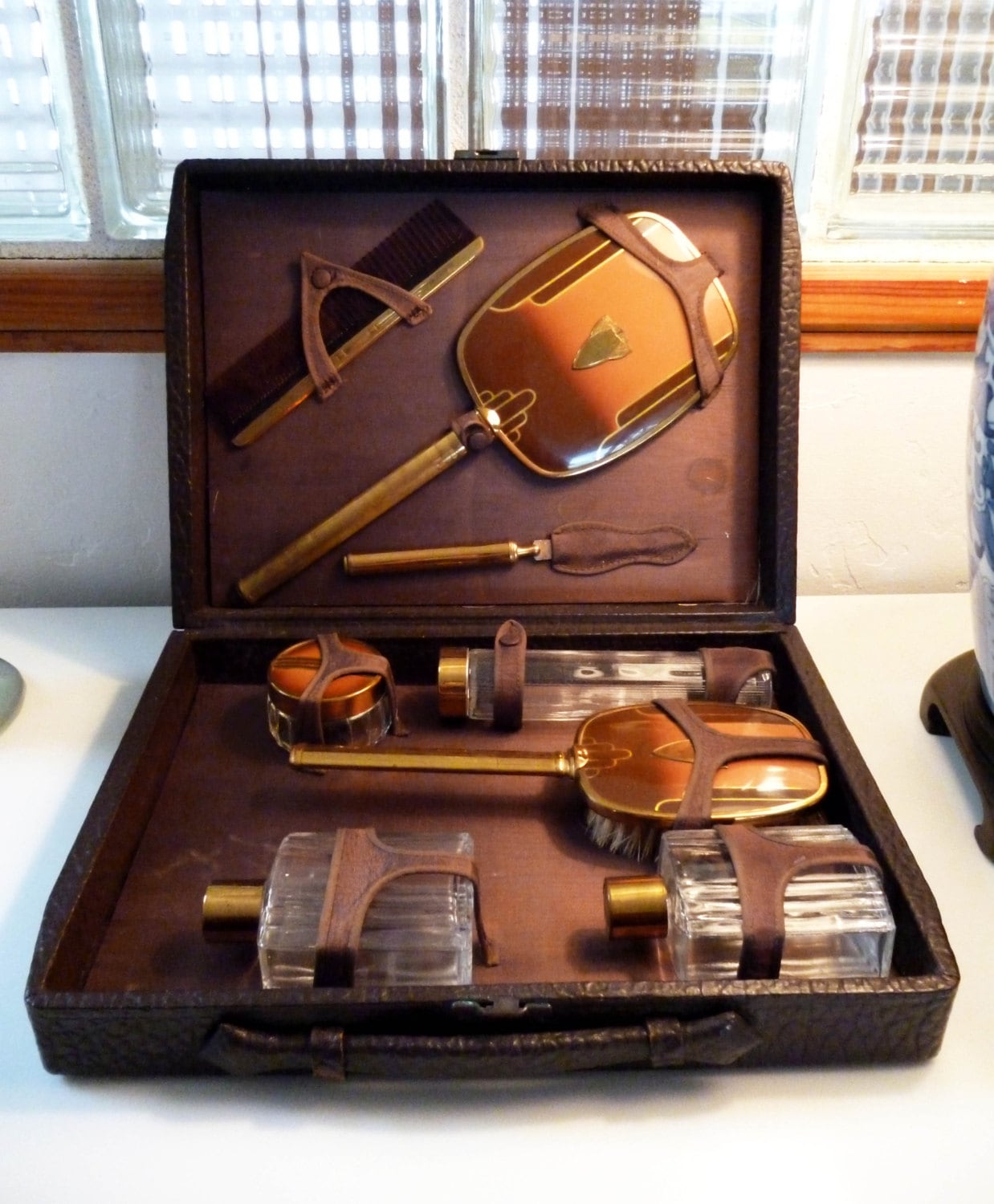
His bedroom was the simplest room of all - except where the dresser was garnished with a toilet set of pure dull gold. Daisy took the brush with delight, and smoothed her hair, whereupon Gatsby sat down and shaded his eyes and began to laugh."
Rare - ART DECO Amber colored  Mens Travel or Dresser Set 8 Pieces and COMPLETE with CowHide Leather Case


Get inspired...

Monday, April 1, 2013

Design Trends for 2013 (Part 3)

Deck the Walls: Emphasis On Art

"Everyone will be focusing on art -
it's so much more approachable these days,
with art fairs popping up everywhere."

~ Sara Story
Art brings a vibrancy and life to a space to like nothing else can. Art touches our minds and souls and speaks to us; sometimes loudly and sometimes soft.

Art gives a space a mood and feeling that can be felt the moment one encounters it.

Bold colors and graphics are in for 2013, and you can use art to bring these elements into your world.

Live In (Not Just With) Art…

Showcase a single, large, artwork to make it stand out and be a focal point.

A large, colorful, Nancy Graves painting, hung as the centerpiece, adds a vibrancy to an otherwise neutral space in the late designer Alberto Pinto’s apartment.


A sculptural staircase framed in polished chrome catches the eye in late AD100 interior designer Alberto Pinto’s lively Rio de Janeiro apartment , which was renovated by architect Thiago Bernardes . Pinto designed the sofa, the painting is by Nancy Graves, and the armless chairs are by William Haines . ( Architectural Digest - September 2011)

Remember to keep scale in mind when hanging pictures on the wall. A small picture on a large wall doesn’t give it more attention, it makes it fade into the background. You can hang multiple smaller pictures together to create the feel of a larger piece.

A grouping of geometric prints, in Todd Alexander Romano’s apartment, creates the look of a single, large piece, and draws attention to them as a whole, but individually as well, due to the varying colors. A single, bold yellow print, is perfectly balanced on a smaller sized adjoining wall.


Inside a glass tower overlooking the Manhattan skyline, Todd Alexander Romano created a high-impact design for his 600-square-foot studio. Inspired by the bold color choices of legendary decorator Billy Baldwin, the designer lacquered the walls and upholstered the custom-made sofa in midnight-blue. Prints by Robert Goodnough and Josef Albers add a vibrant contrast. (Architectural Digest - February 2011)

Get Inspired...

Design Trends for 2013 (Part 2)

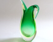
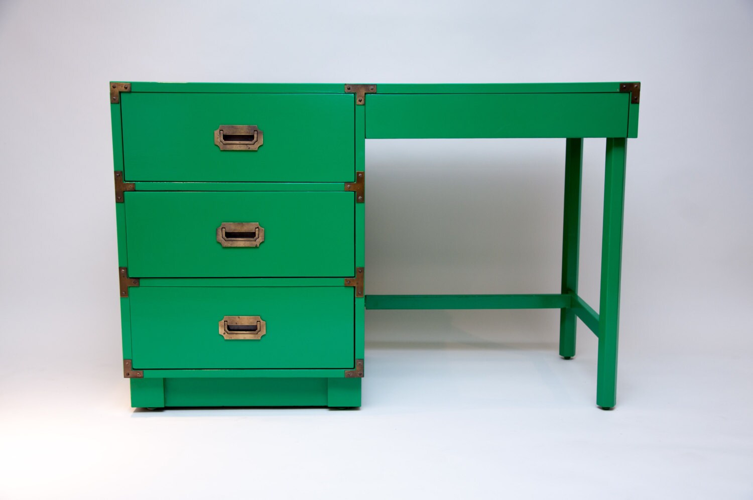
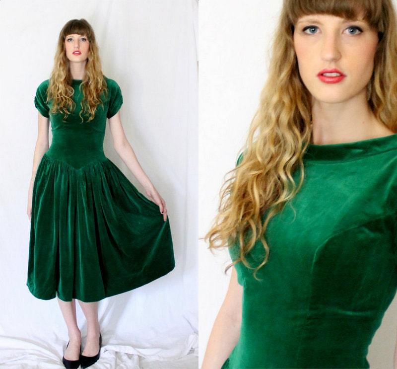
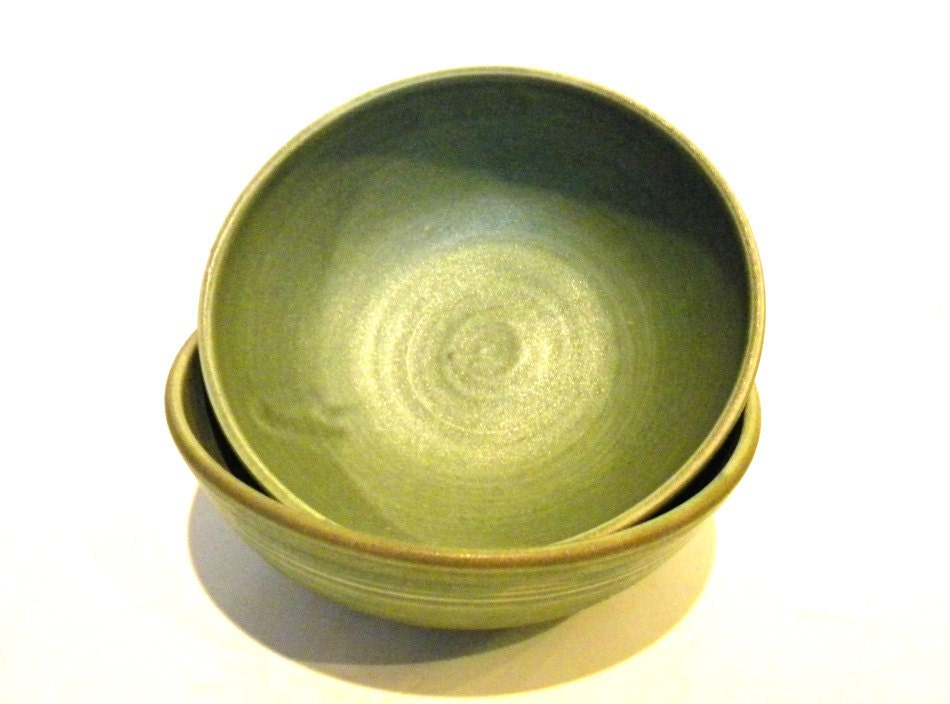
Color Inspiration: Green

Pantone® has named Emerald as the Color of the Year for 2013 in their Fashion Color Report for Spring 2013.

That doesn't mean you can only use that one color. There are hundreds of shades of green, so finding one that suits your lifestyle and decor shouldn't be a challenge.

Think outside the typical green box and experiment with variations of shades of greens like bright spring greens or olive tones, and blue-greens or teal.

ELLE DECOR® asked five designers what they loved about green.
Here are a few of their answers. For all five designer’s answers, see the article, “Color Code: Green”.

ELLE DECOR - Color Code: Green - Designer Bunny Williams Bunny Williams
“Mossy greens and unusual browns make sophisticated backdrops for art and antiques,” says New York designer Bunny Williams.

“These walls, in my New York apartment, are painted Cleveland Green by Benjamin Moore and finished with a soft glaze.”
Miles Redd
“My favorite way to use green is with plant material—a maidenhair fern, an exotic leaf in a glass bottle, or a single paperwhite,” says New York designer Miles Redd. “Green is a subtle reminder of nature, and it makes you feel healthy, fresh, and alive.”

“The old-gold walls make for cozy candlelit dinners, but the refreshing emerald-greens from the plants and curtains make this room equally enjoyable at breakfast.”
ELLE DECOR - Color Code: Green - Designer Miles Redd
Steven Gambrel
“The color green is a statement, and I don’t care much for the very palest shades of green, as they seem weak,” says New York designer Steven Gambrel. “A strong bottle-green or absinthe-green is far more memorable and actually really easy to live with.”

“Hits of dark brown and black help cool the color of green down and ground it in its environment,” says Gambrel. “Amber and gold finishes also react really well to a bottle-green background. A lacquered version is the most effective, as there seems to be a transparency to green that is not the case for other colors.”

It's Not Just the Paint... It's You...

Color doesn't exist on walls alone. You can add greens into you're world through furniture, art and decor, clothing, jewelry and other accessories.

Art and decor pieces add a splash of color and can easily be changed to the season or your mood. We are always switching out different pieces in our house to re-energize the space. Sometimes just moving them from one room to another, or storing them away to use again later.

Clothing and accessories let you take the color with you wherever you go and make you feel good, standout, and get noticed.

Get Inspired...


Shine On: Lacquer and Gloss

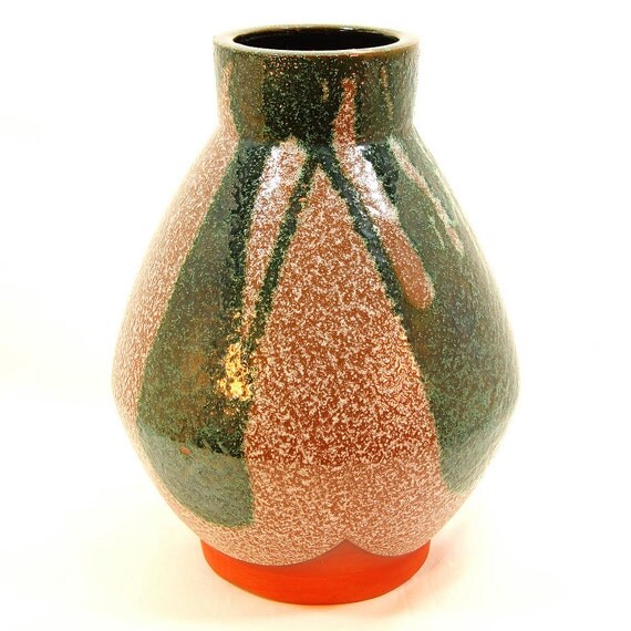
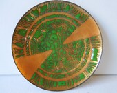
Terracotta Color Block Vase with Tan / Taupe Glaze and Green Free-Form Color Blocks, Textured Surface, Unsigned Vase, ca. 1970s from ZoeDesignsVintage on etsy.com “Gloss!
High gloss!
Shine! Polish!
Lacquer!”

~ Jeffrey Bilhuber
Look for ways to bring high sheen surfaces into your home. Maybe a polished marble table, a high-gloss lamp, or enamel or lacquer accessories.

But if you want to make a bold statement, here are two great examples.

Designer Jeffrey Bilhuber lacquered the ceiling of his guest room in Benjamin Moore’s Jupiter Glow.

Lacquered ceiling in designer Jeffrey Bilhuber's apartment - elledecor.com
In a windowless entry hall, designer Christina Murphy chose HO1950 by Fine Paints of Europe to lacquer the walls a rich green, and reflect light from adjoining rooms.

Lacquered entryway in designer Christina Murphy's apartment - housebeautiful.com
Get Inspired...