| Deck the Walls: Emphasis On Art |
|
"Everyone will be focusing on art -
it's so much more approachable these days, with art fairs popping up everywhere." ~ Sara Story |
Art brings a vibrancy and life to a space to like nothing else can. Art touches our minds and souls and speaks to us; sometimes loudly and sometimes soft.
Art gives a space a mood and feeling that can be felt the moment one encounters it.
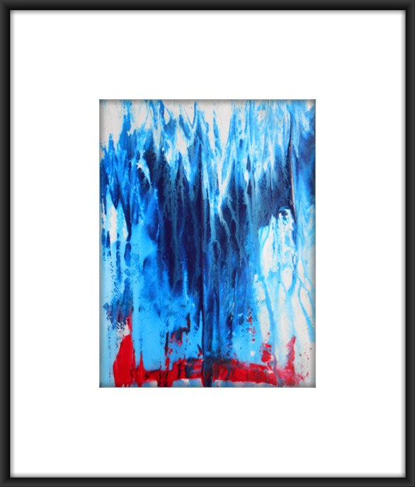
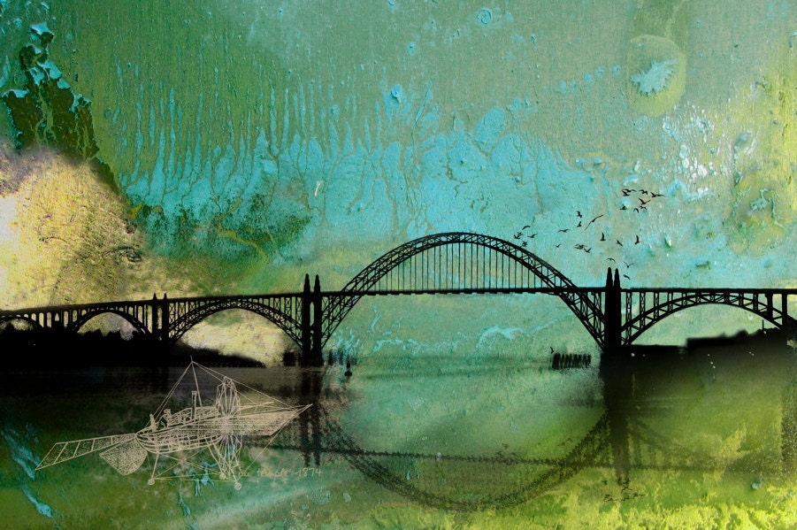
Bold colors and graphics are in for 2013, and you can use art to bring these elements into your world.
Live In (Not Just With) Art…
Showcase a single, large, artwork to make it stand out and be a focal point.
A large, colorful, Nancy Graves painting, hung as the centerpiece, adds a vibrancy to an otherwise neutral space in the late designer Alberto Pinto’s apartment.

A sculptural staircase framed in polished chrome catches the eye in late AD100 interior designer Alberto Pinto’s lively Rio de Janeiro apartment , which was renovated by architect Thiago Bernardes . Pinto designed the sofa, the painting is by Nancy Graves, and the armless chairs are by William Haines . ( Architectural Digest - September 2011)
Remember to keep scale in mind when hanging pictures on the wall. A small picture on a large wall doesn’t give it more attention, it makes it fade into the background. You can hang multiple smaller pictures together to create the feel of a larger piece.
A grouping of geometric prints, in Todd Alexander Romano’s apartment, creates the look of a single, large piece, and draws attention to them as a whole, but individually as well, due to the varying colors. A single, bold yellow print, is perfectly balanced on a smaller sized adjoining wall.

Inside a glass tower overlooking the Manhattan skyline, Todd Alexander Romano created a high-impact design for his 600-square-foot studio. Inspired by the bold color choices of legendary decorator Billy Baldwin, the designer lacquered the walls and upholstered the custom-made sofa in midnight-blue. Prints by Robert Goodnough and Josef Albers add a vibrant contrast. (Architectural Digest - February 2011)
Get Inspired...
|
|
|
|
|
|
|
|
|
|
|
|

No comments:
Post a Comment